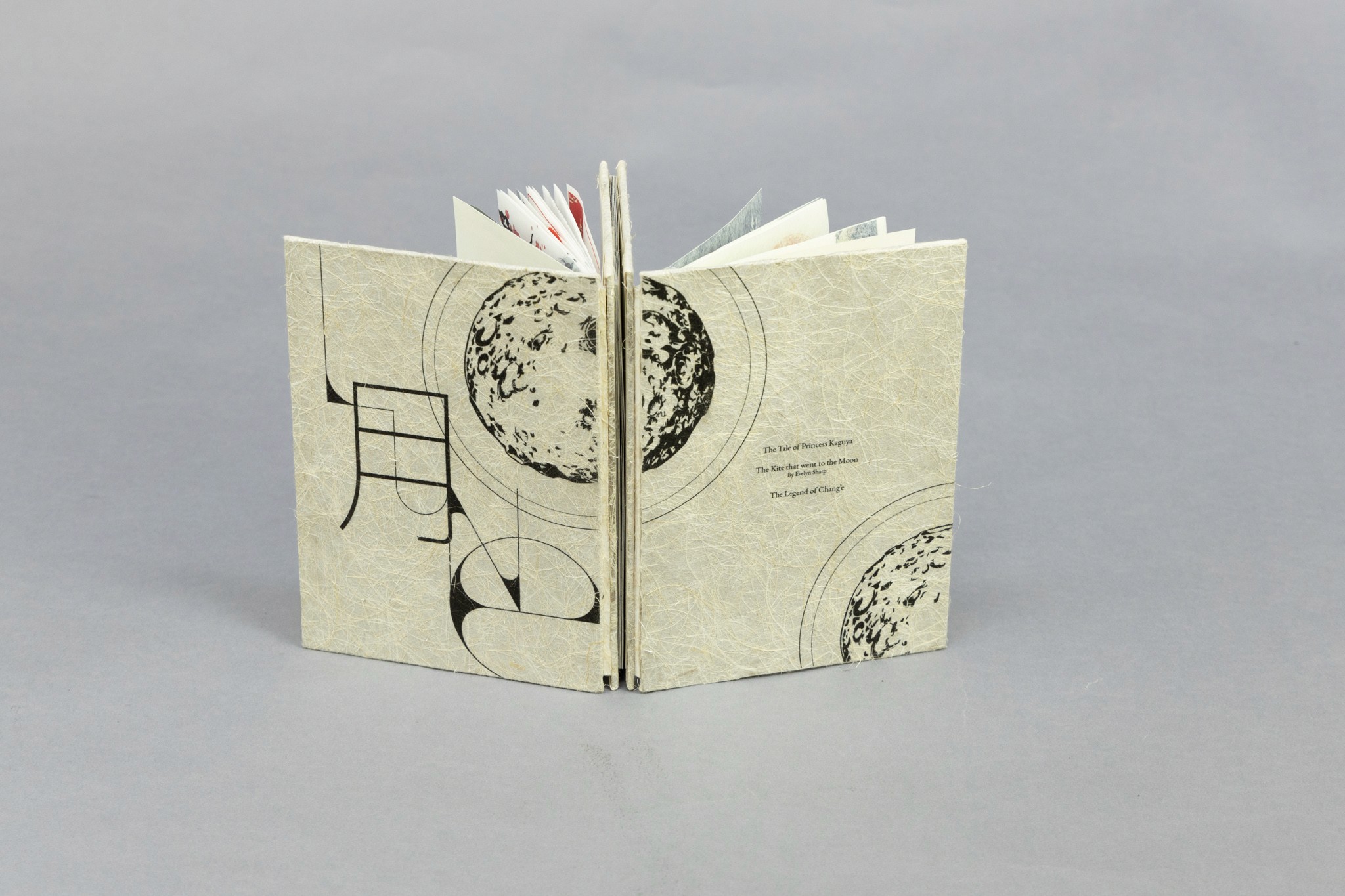
The Tale of Princess Kaguya
The first story of Lune is the Japanese tale, The Tale of Princess Kaguya. Using the national color of Japan, I added hints of red through every spread of the English translation of the story because it is bad luck in Asian culture to write in red. The typography of this story was whimsical and organic compared to the traditional justified or boxy text. I used a special type of washi paper called Asuka White which has a soft white glow to the paper that accentuated red tones. Due to the transparent nature of the paper, I designed the pages in correspondence to the next page, resulting in an in-depth, picturesque scene. The illustrations have the style of traditional Japanese ink painting, emitting a feeling of flow. Since Japanese books are read from right to left, top to bottom, the binding of the book is also on the right hand side.

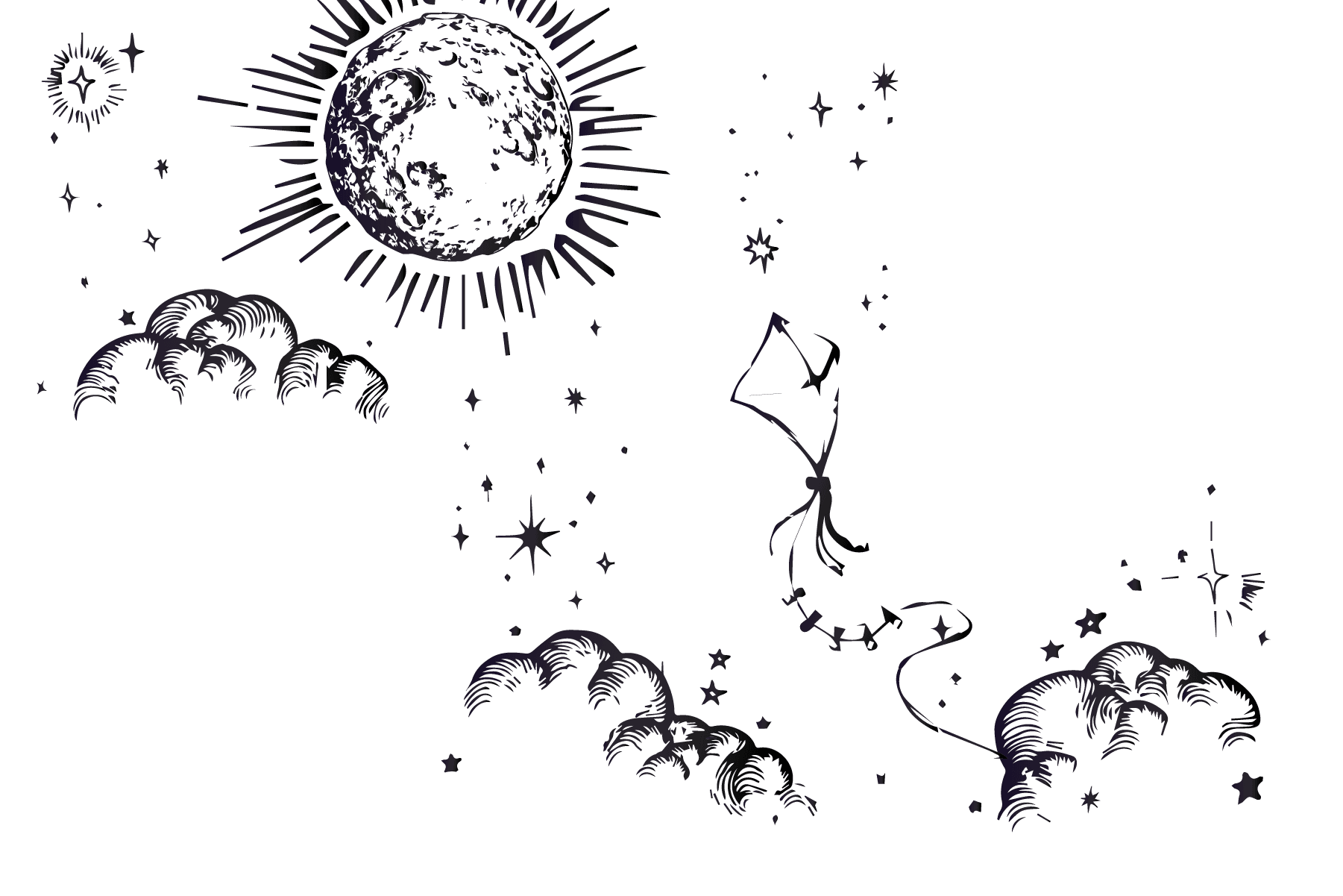
The Kite that Went to the Moon
This English fairytale was designed with heavier notes in contrast to its Asian counterparts. I selected a heavier weight, yellow tinted paper that suited the bold illustrations. Drawing inspirations from clothbound books, the design of this book reflected classic books with decorative illustrations. Using a dark navy ink for the text and illustrations on yellow paper made it easier for readers to read instead of black ink on bright white paper. Like all western novels, this book is read from left to right with the binding on the left side.

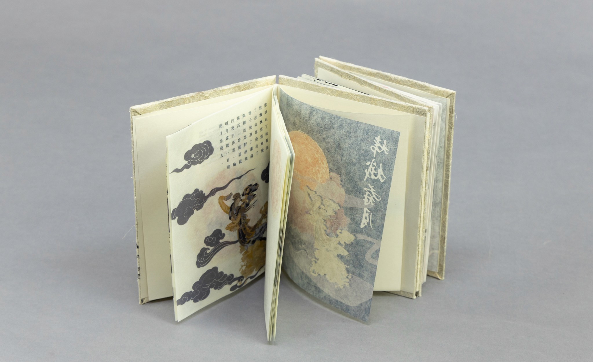
The Legend of Chang E
The biggest difficulty for this Chinese tale was to differentiate it from the Japanese story yet also maintaining similarities due to the likeness of both cultures. Compared to the free typography of Princess Kaguya, I made the text justified for all spreads, replicating the ancient Chinese chops or seals. The color scheme was a deep purple and gold combination. Gold and purple were colors used only by the emperors whom are the main characters of this story. The illustrations were inspired by modern takes on ancient Chinese paintings which are bolder in contrast. Also using a special type of washi paper, I opted for the yellow tinted Niyodo Kozo. Similarly, I also paid attention to the bleed of each page and designed so the next page added dimension to the front page. Chinese books are also read from right to left and so the book is right bound.
The Solution
The moon on the cover page is hidden in each story to tie them all together. The cover pages were printed on washi paper with hair fibers, symbolizing the thread of story telling. Despite different cultures from different time periods, myths and fables can bring people from all backgrounds together.
Using a dos-à-dos, a French styled binding that results in the spine forming a zig-zag, allowed books of different reading orientation to be bound into one. I manually created four hard covers to increase stability of the book.